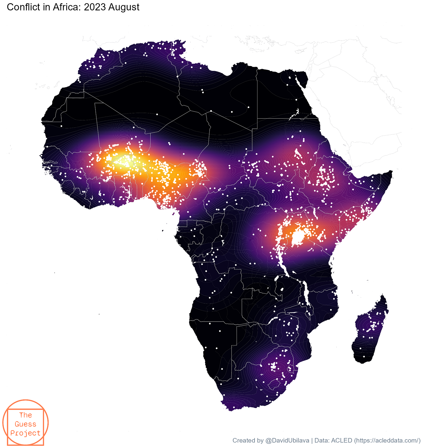
Density gradient maps and conflict in Africa
On a social platform, I recently posted an animated map showing the evolution of conflict hotspots across Africa over the past two decades or so. I will get to the “animated” bit shortly, but first, let’s consider a map with conflict hotspots.
A case in point is a density gradient map. This was something I had been meaning to do for a while. Then I saw Andrew Heiss’ post and challenged myself to replicate the concept (albeit on a different map and in a different context).
Here is the map. It is based on data obtained from the Armed Conflict Location & Event Data Project (ACLED) for the month of August 2023.
How can we create a density map such as the one above? In just a few lines of code (as great Matt Cowgill would say). In fact, just one line of code is all that we need as far as the density bit of the plot is concerned, and that’s:
geom_density_2d_filled(data=dt,aes(x=longitude,y=latitude),bins=100)Now, this one line, of course, will not generate the map for you. At the end of this post, there is a link to the R code and data, so you can replicate the plot and change it as you wish. My only point here is that once you sort out all the other nitty-gritty stuff, adding density to the map is not that complicated.
And now, the animation. This is a slightly updated (and, I’d like to think, improved) version of what I posted before.
This animation, in effect, is three-hundred-something maps, one for each month from January 1997 to August 2023, aligned chronologically in a single gif. And the mechanics of creating this gif is pretty much just that.
First, we generate and store a set of figures. I store these in a subfolder within the folder where I work. Call it “temp” (as in, temporary), for example. I also prefix the names of the figures with ascending numbers. For example, if there are less than 100 figures, I name those as “01-fig.png”, “02-fig.png”, etc. If there are more than 100 (but less than 1000) figures, I name those as “001-fig.png”, “002-fig.png”, etc. This is to ensure the (chronological) ordering.
Then, we create the gif. We will call it “density.gif” For this, we will need a package called magick. Assuming the package is installed and loaded, the following four lines will do the trick (compiling might take a little while):
the_list <- paste0("temp/",list.files("temp/"))

frames <- lapply(the_list,image_read)

animation <- image_animate(image_join(frames),fps=10,dispose="previous")

image_write(animation,"density.gif")
And that is how one creates the flashy (pardon the pun) animation.
I will conclude with a note of caution: these densities illustrate the relative abundance of dots (conflict incidents, in our case). So, in each separate map, the “hotspot” is, sort of, relative to the average number of conflict incidents in that month. In other words, the bright areas at the beginning of the gif (e.g., January 1997) do not represent the same number of conflict incidents as the bright areas at the end of the gif (e.g., August 2023). Indeed, in this time period, the number of recorded conflict incidents increased quite a bit.
Replication material is available here


